Black Rock Restaurant Group
RESTAURANT GROUP BRANDING, BRIGHTON, U.K.
The Black Rock Restaurant Group has grown a loyal and passionate customer base since the launch of its first restaurant, the Coal Shed, in Brighton in 2011. Delivering a distinct and dependable restaurant experience, the group was founded by restaurateur Razak Helalat, and now has restaurants in both London and the South East of England.


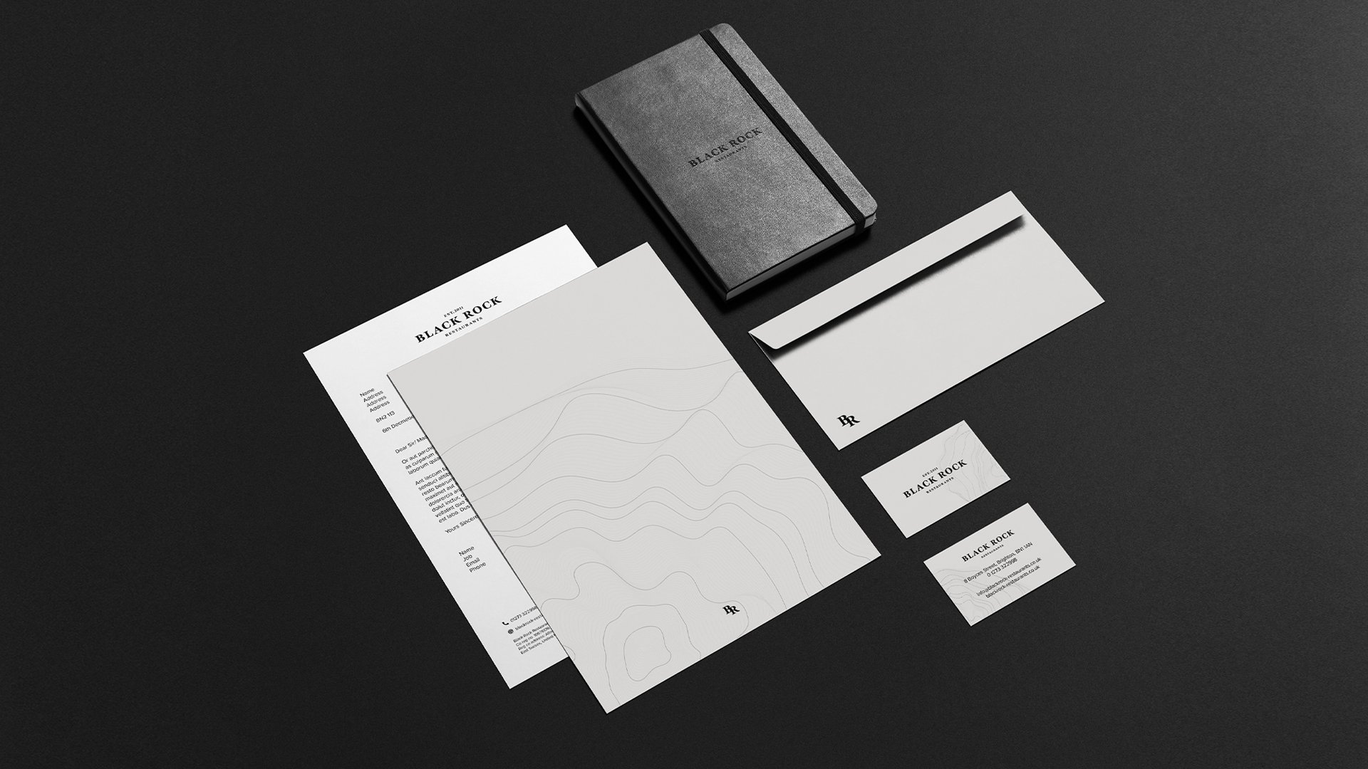
Good Noise were commissioned to create the group's brand identity, which included a logotype, monogram and associated brand assets. The brand was then applied across a number of applications, including a website and stationery.
We started our process by reviewing the personalities of the different brands within the group's portfolio, and then identifying the common characteristics between them. This helped us to define Black Rock's own brand DNA - and informed our design decisions going forward.


For the identity, we created a simplistic logotype that would not only complement the look of the group's current restaurants, but also be simple enough to complement future projects within Black Rock's ever-expanding portfolio.
We chose the typeface as it bore similar qualities to early letterforms that would have been carved by stonemasons. The topographic pattern we have used throughout the branding reinforces this reference to natural forms.
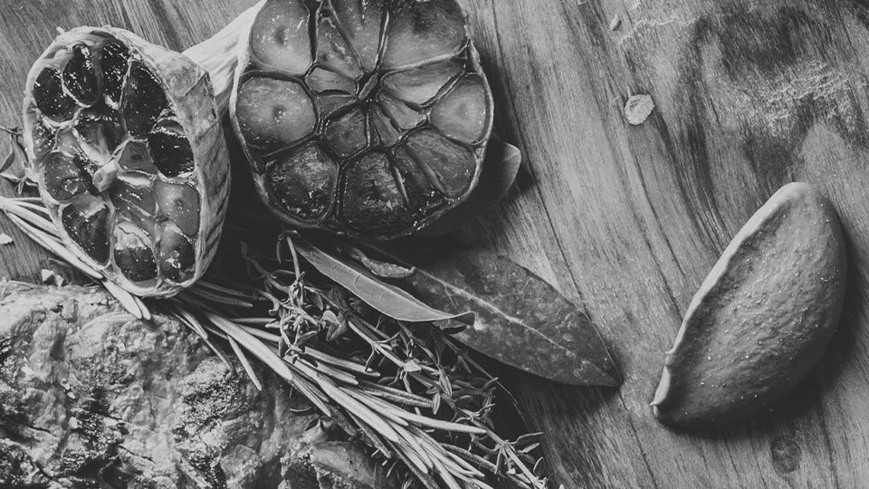
For the website, we combined these elements with close-up black and white photography, which evokes the fire and energy found in busy restaurant kitchens.
The final result is smart, authentic and approachable - and driven by craft and quality - all attributes which are upheld by the Black Rock Group in the day-to-day running of their restaurants.


